

Art Direction, Design
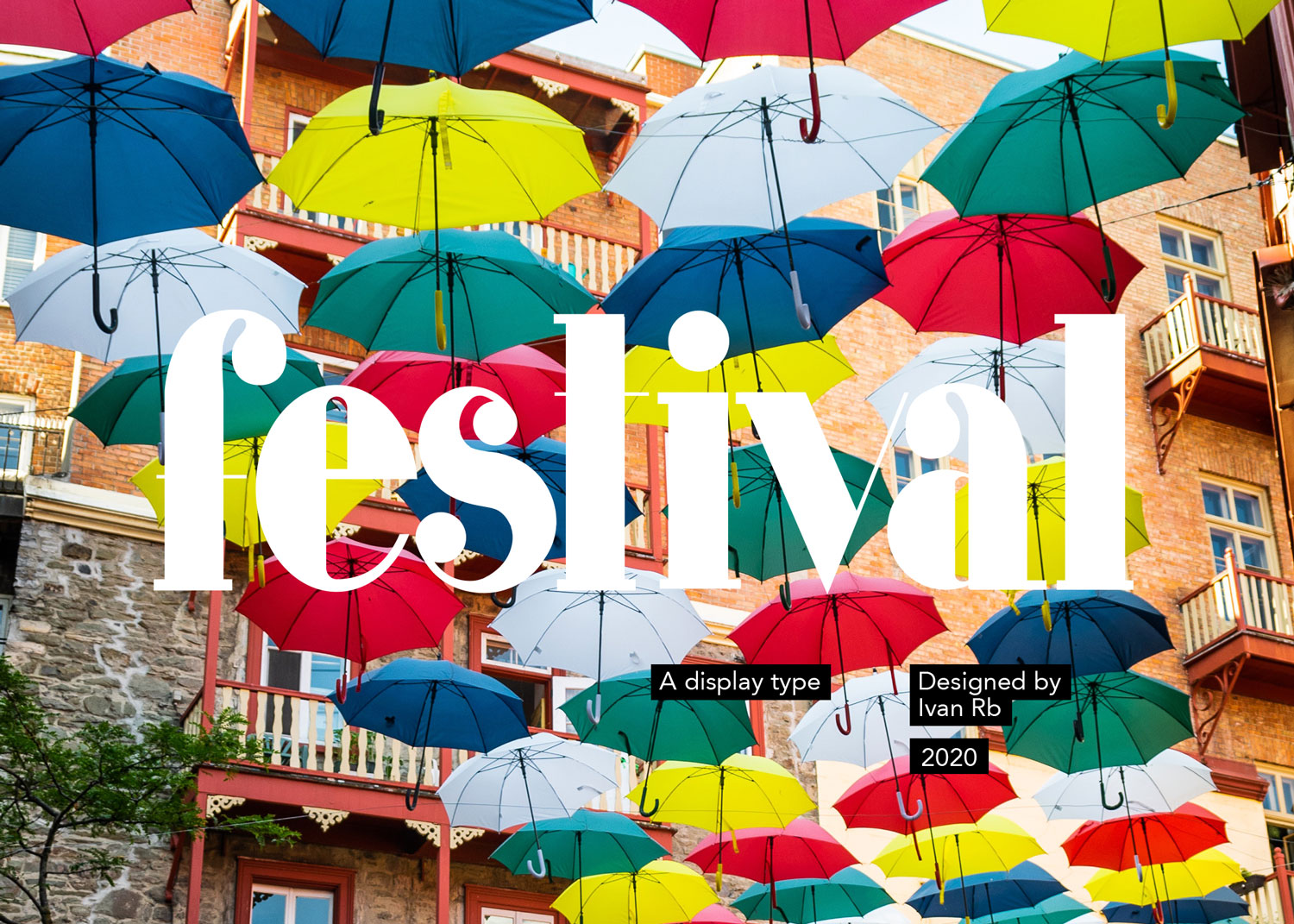
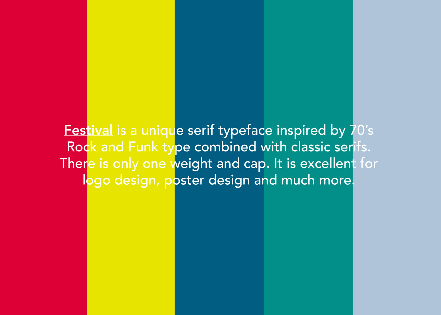
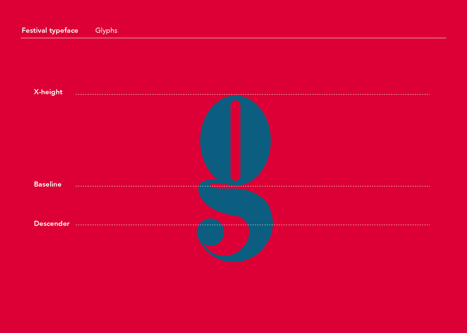
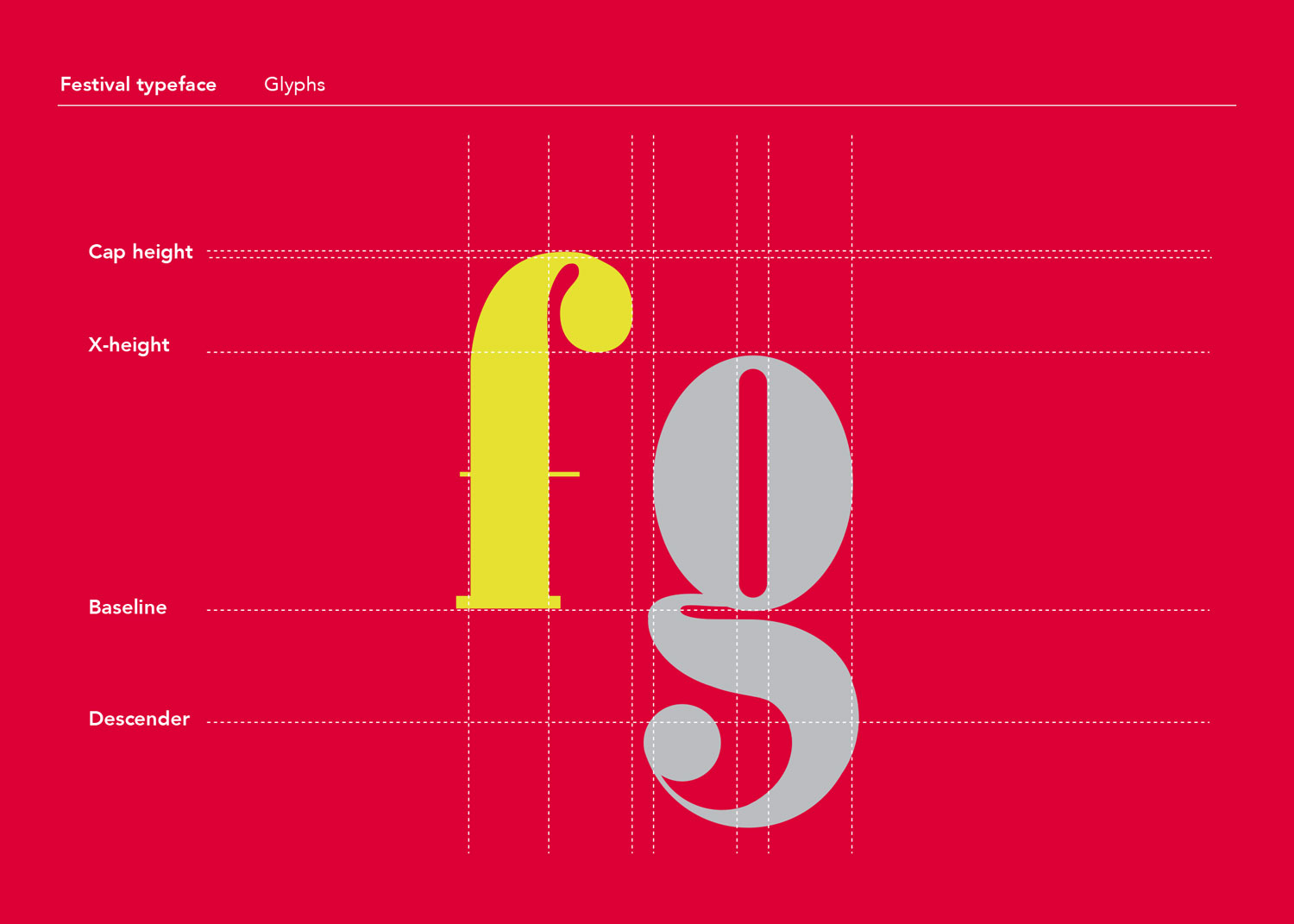
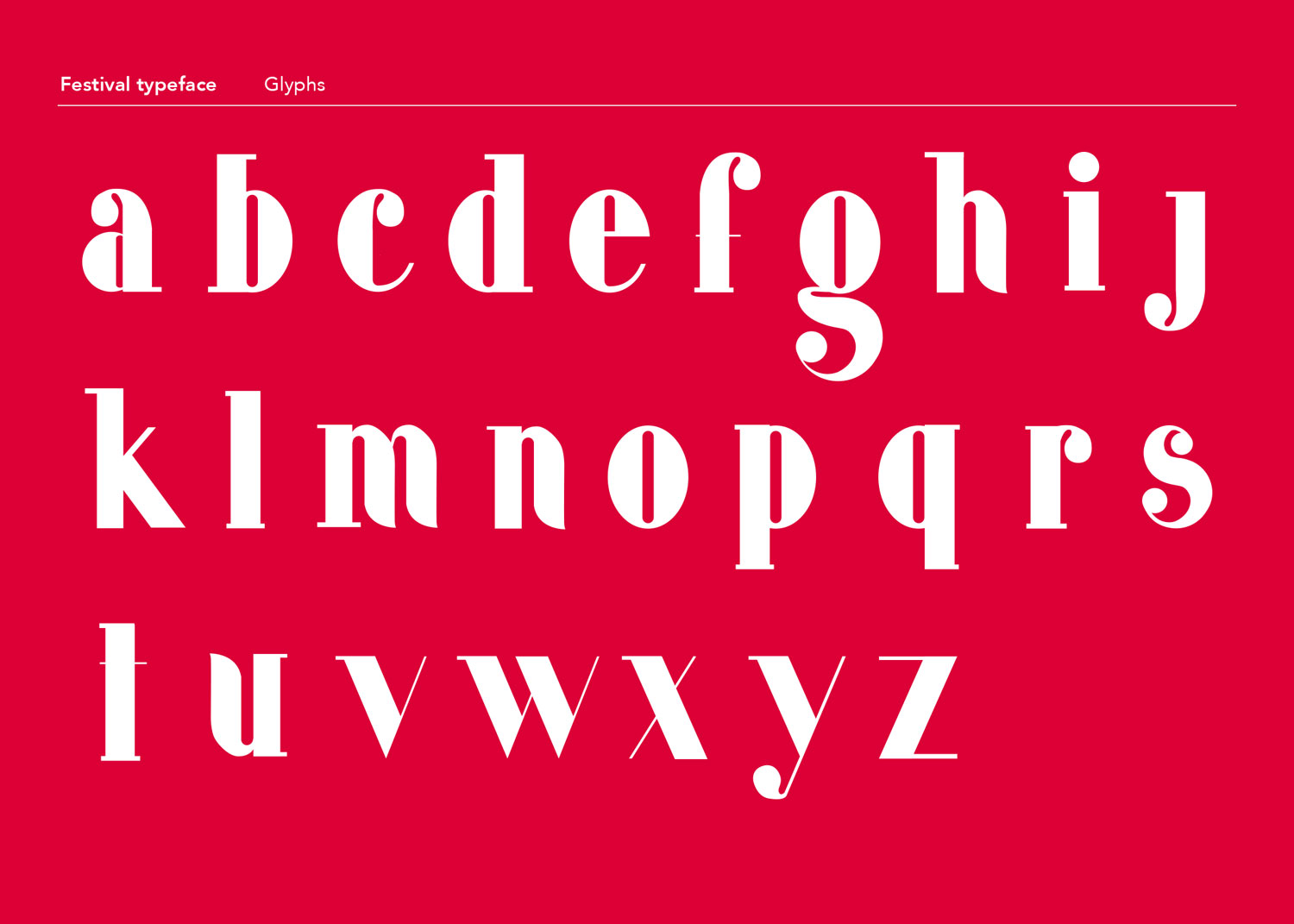
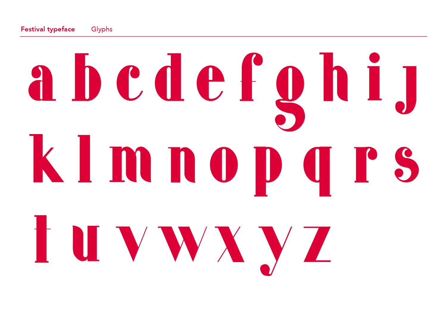
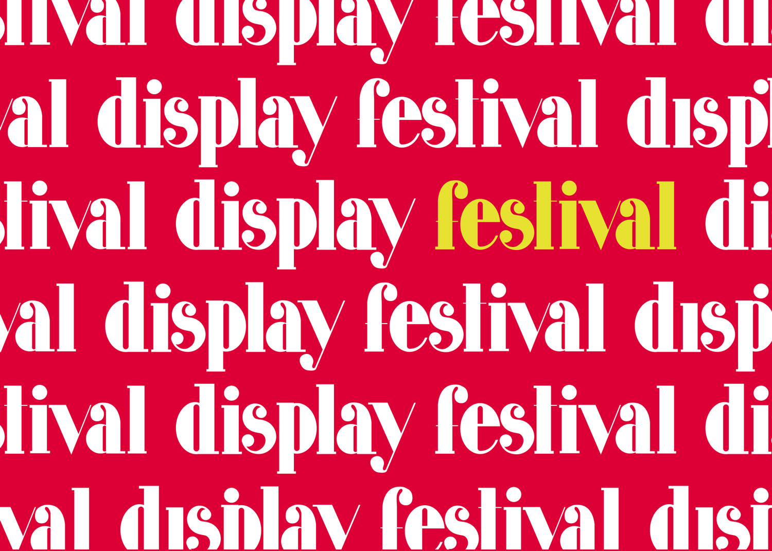
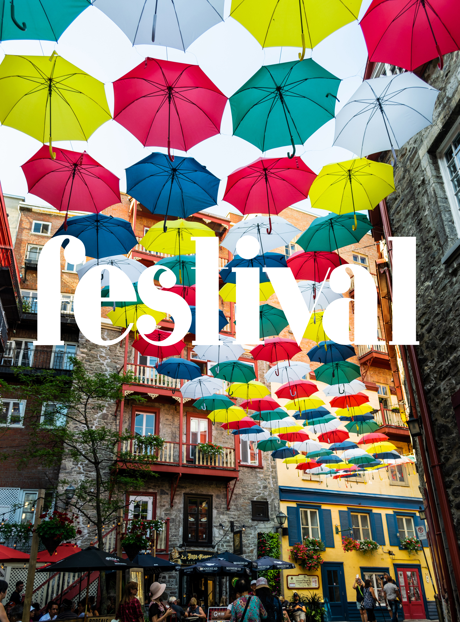
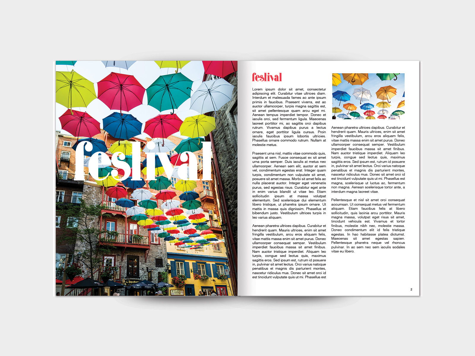
I was commissioned for a project in which I needed a specific display type that I simply couldn’t find or purchase. It had to be aligned with the rock and funk type of the 70s. After completing the control letters and the words that I needed for that piece I figured - why stop there? I continued to create the entire typeface which I then named “Festival”. Eventually, I would like to expand upon this and add an upper case alongside refinements to the existing lower case.
