

Digital Art, Illustration, Advertising
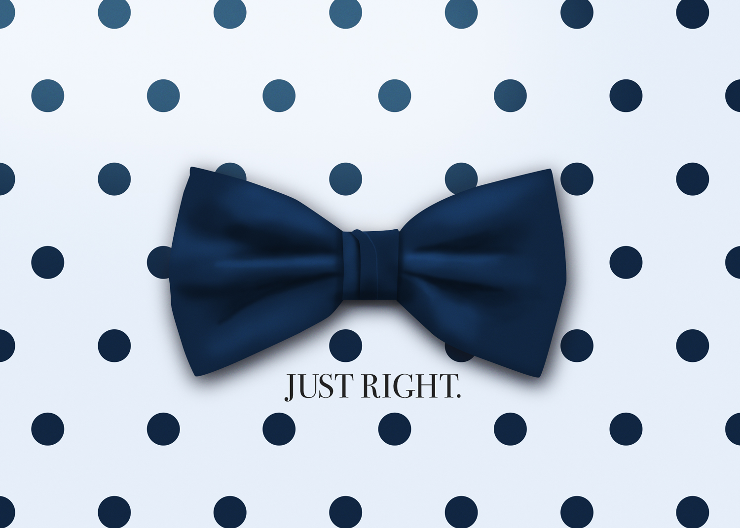
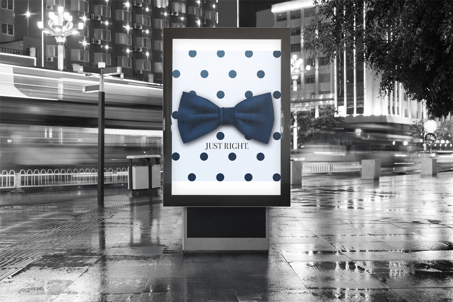
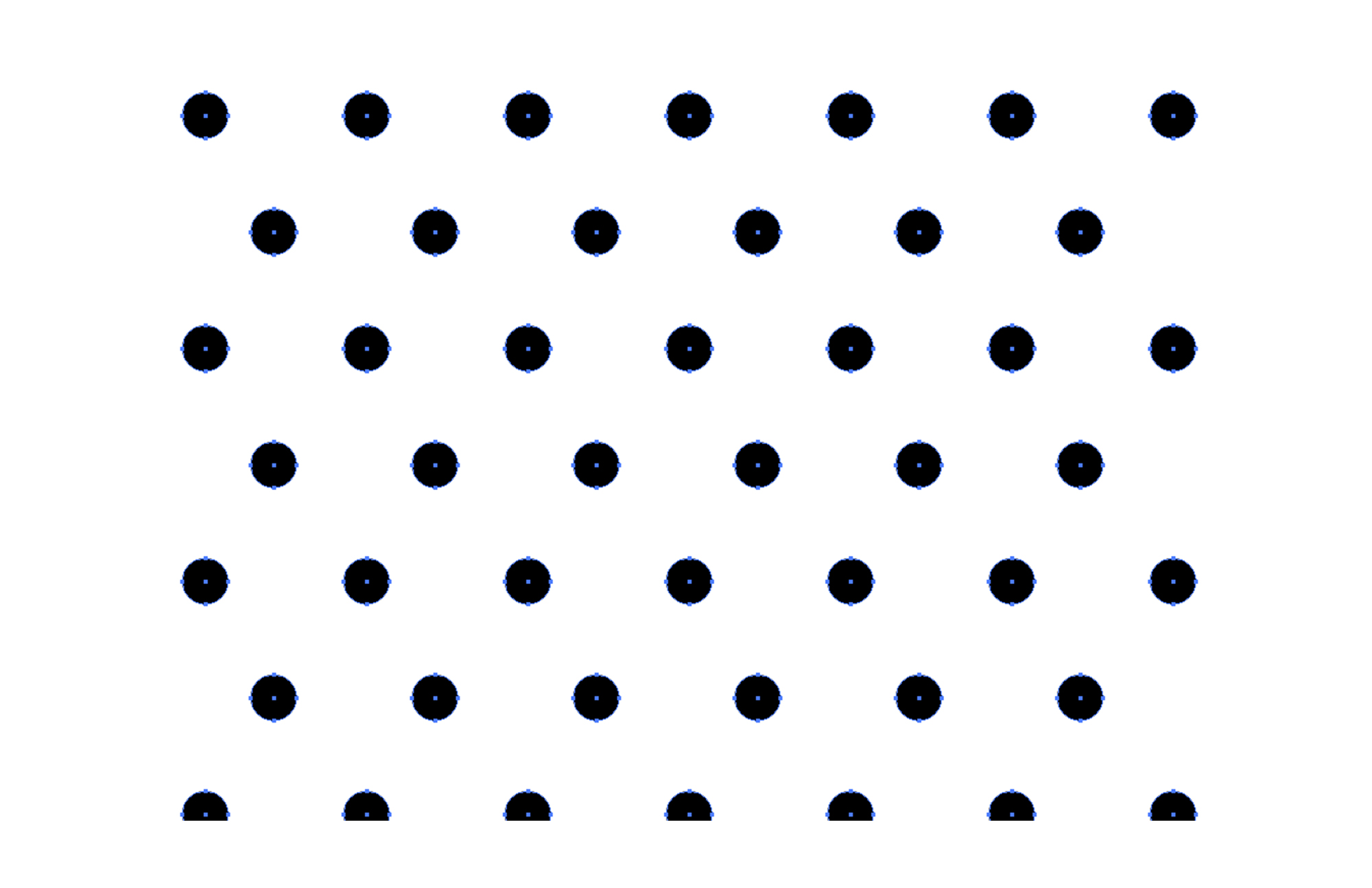
This piece needed to be straight to the point: the bow tie had come back as panache - the way it once was and is now rebecoming. It had to show both its geekiness and it’s confidence all at once which is why it was placed on a polka-dot pattern with copy that read exactly that - just right. The feeling you get when you get one of these things on and looking sharp.
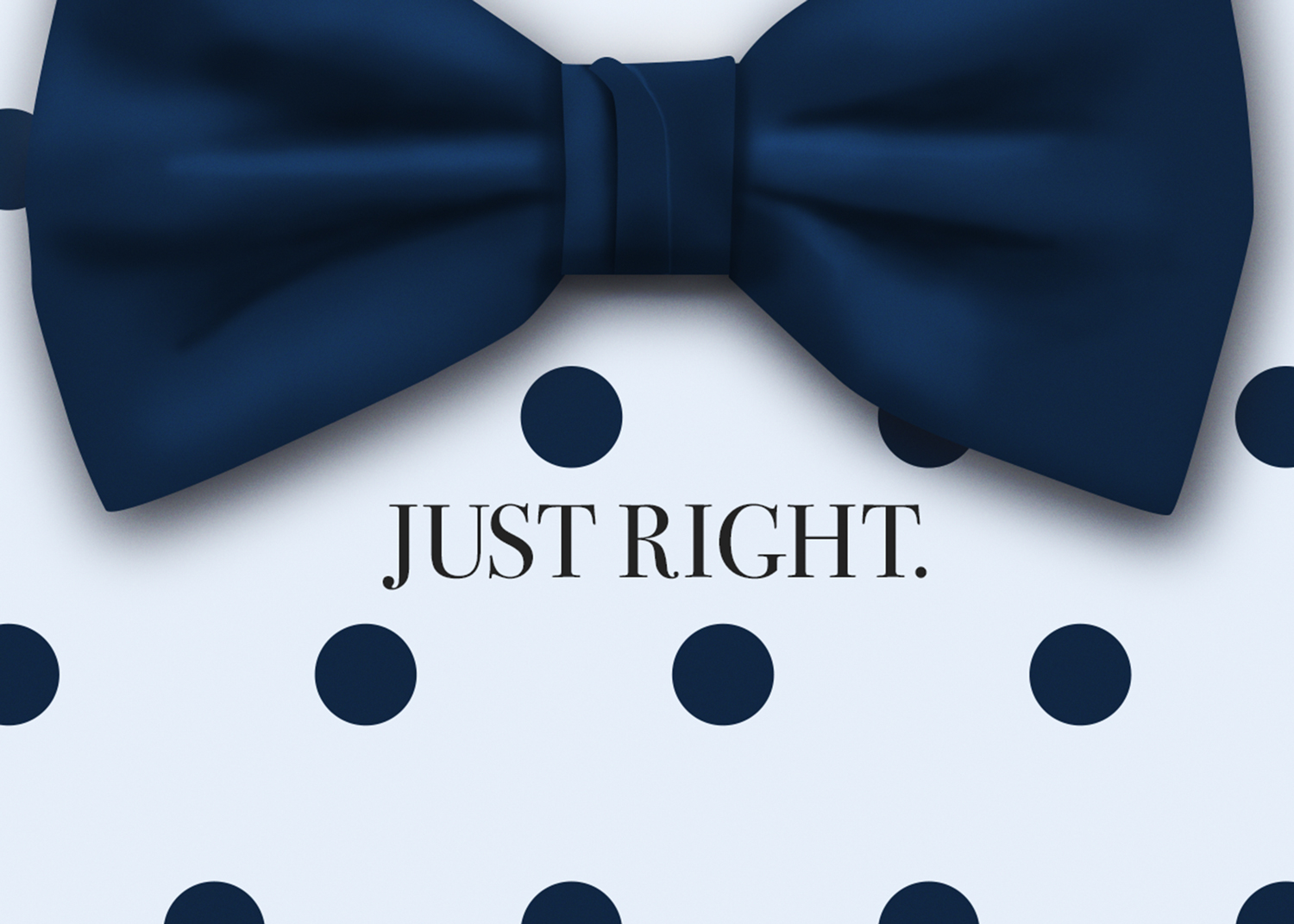
I thus picked a simple serif but kept the bow tie as the focus. Below I show that I drew the bow tie itself between Illustrator and Photoshop with my trusty digital tablet - making sure I got those shadows and highlights just right.
