

Art Direction, Logo Design, Package Design
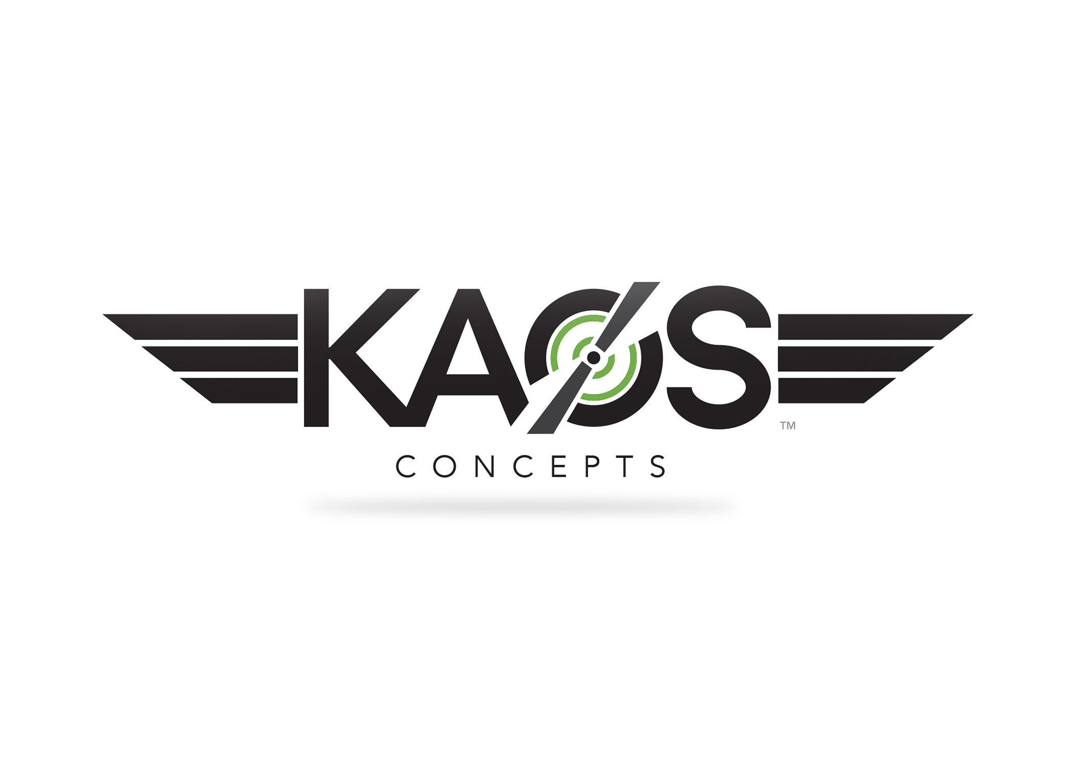
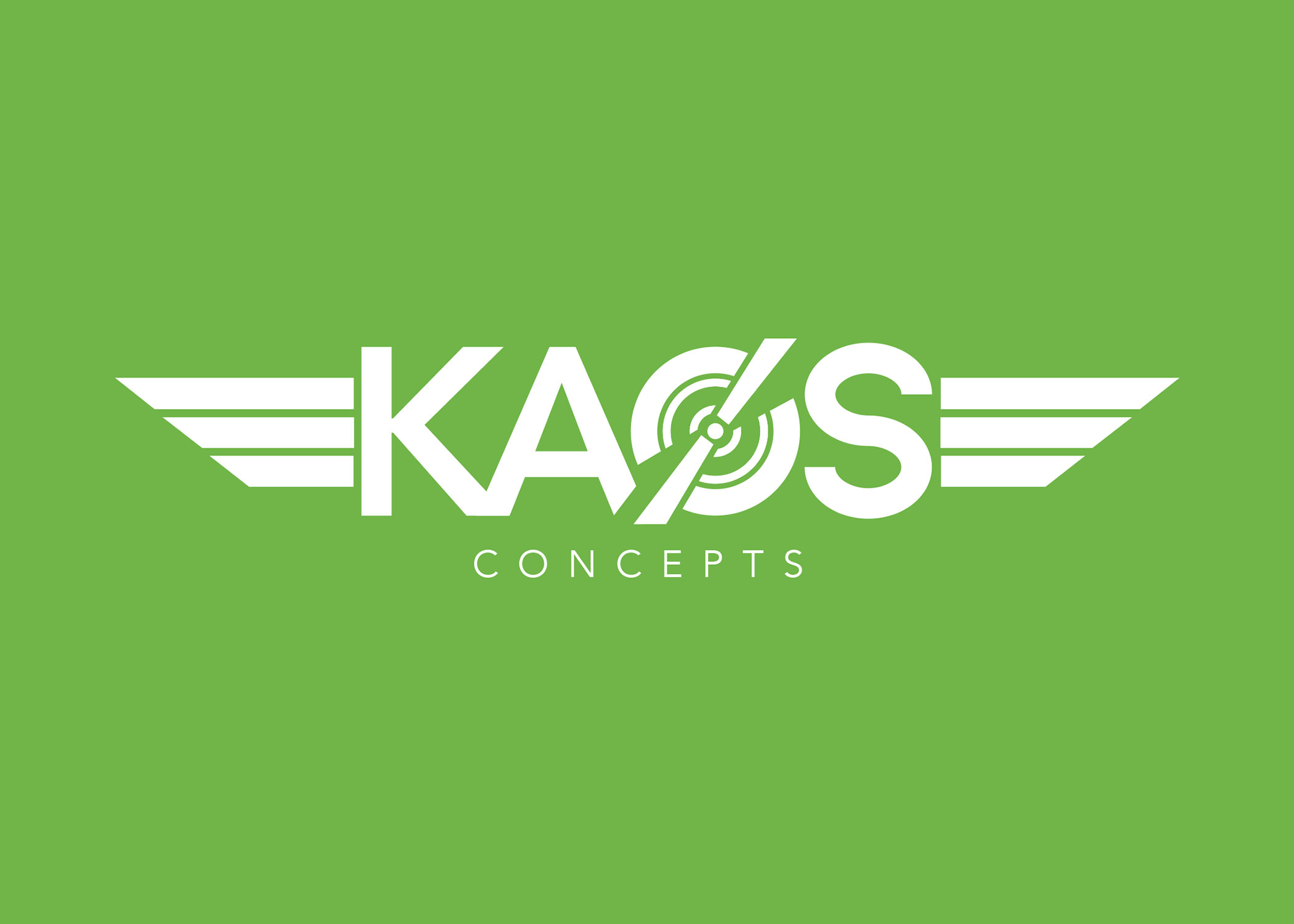
I was contacted to do this logo for a new company out in California building aviation parts but also parts for other typical modes of recreational transportation. The client felt that I could execute a visual identity that would scream modernity and precision. Aside from the mentioned, the mark had to have wings. It had to. In aviation apparently, those are earned.
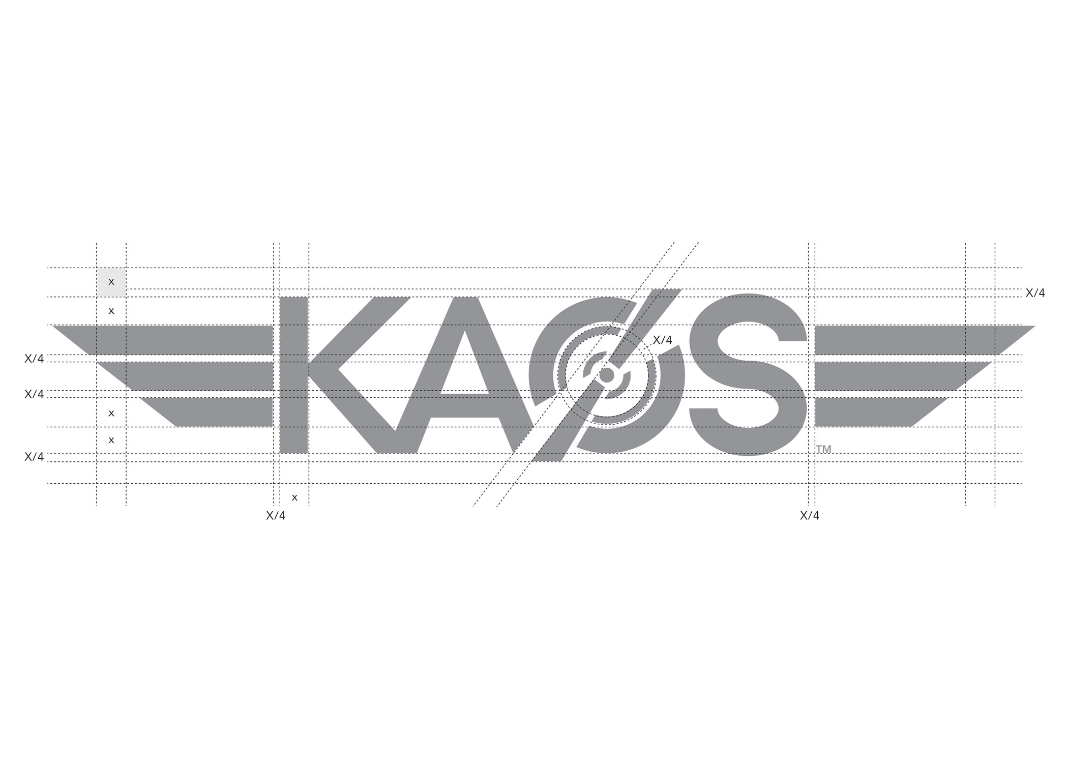
After much research and understanding the wild precision that goes into making parts like those made by Kaos, I knew I had to do something geometric and clean. I chose Avenir as a base typeface but knew I had to do away with the not-geometric “O” and fix up the “S”. Both were created by hand and precision. The next step was to give it some character - thus came the propeller that could also be a bicycle crank in the “O” conveying motion.
We are very happy and greatly impressed with how Ivan was able to understand and interpret our business vision and translate it into a mark that represents it so well. Besides the mark itself, we were impressed with Ivan's professionalism and execution.
