

Art Direction, Illustration, Logo Design
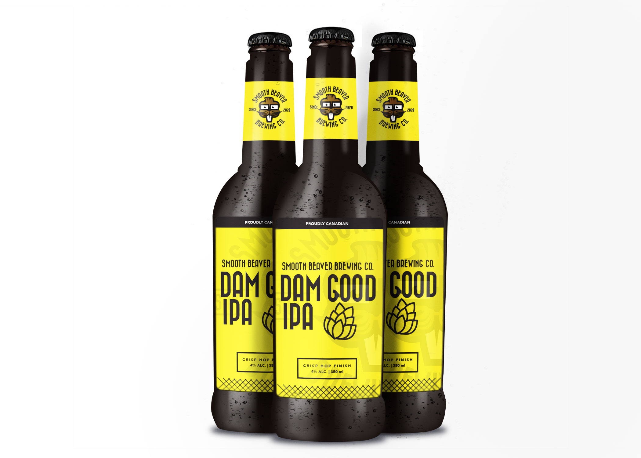
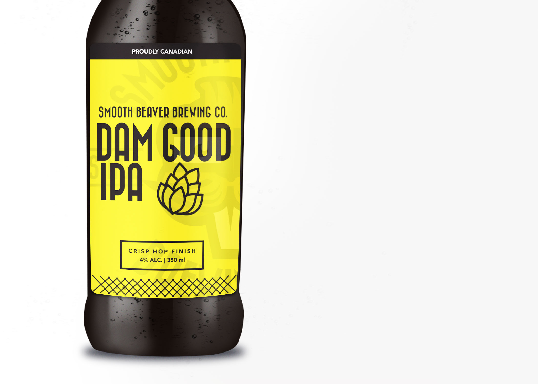
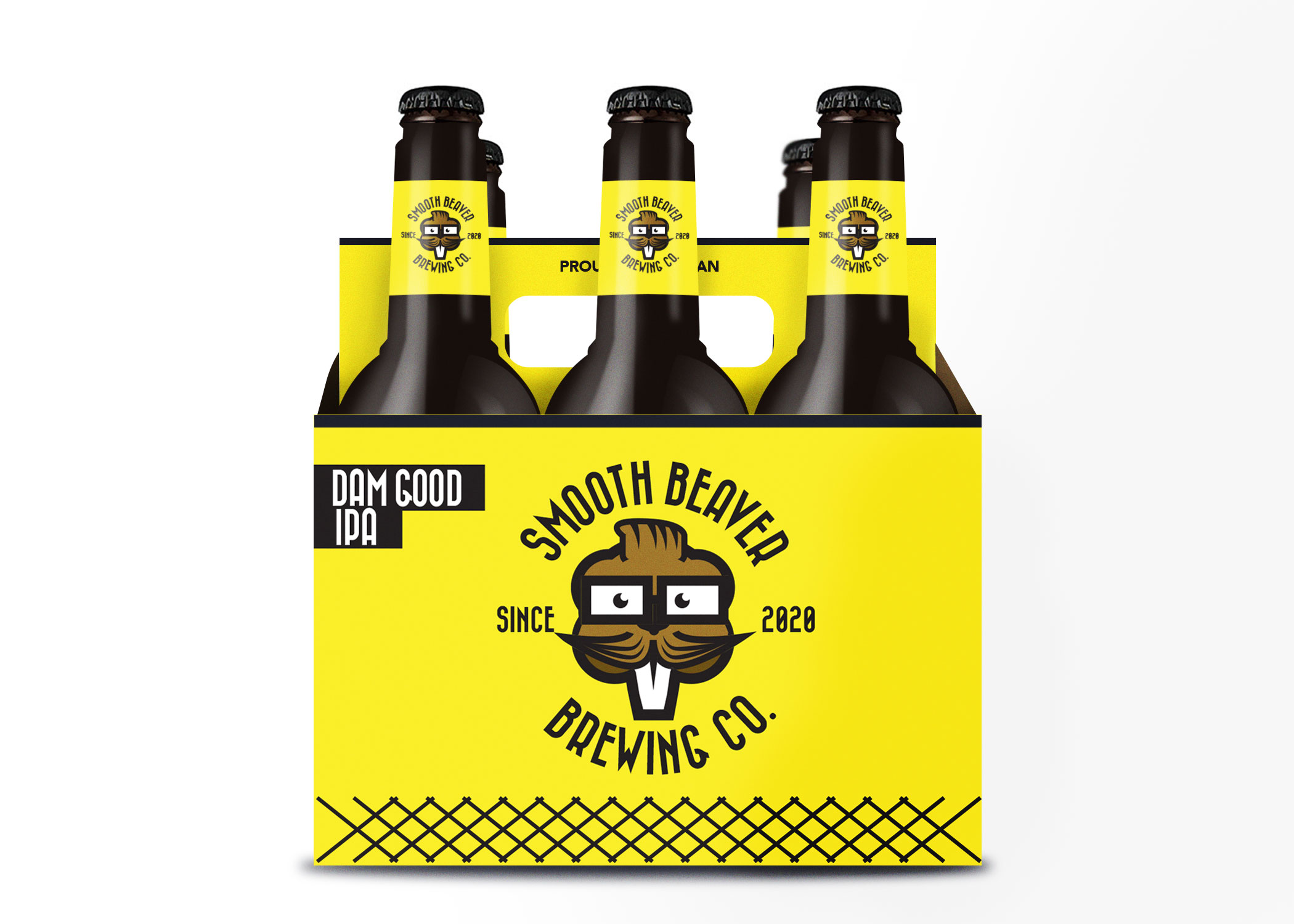
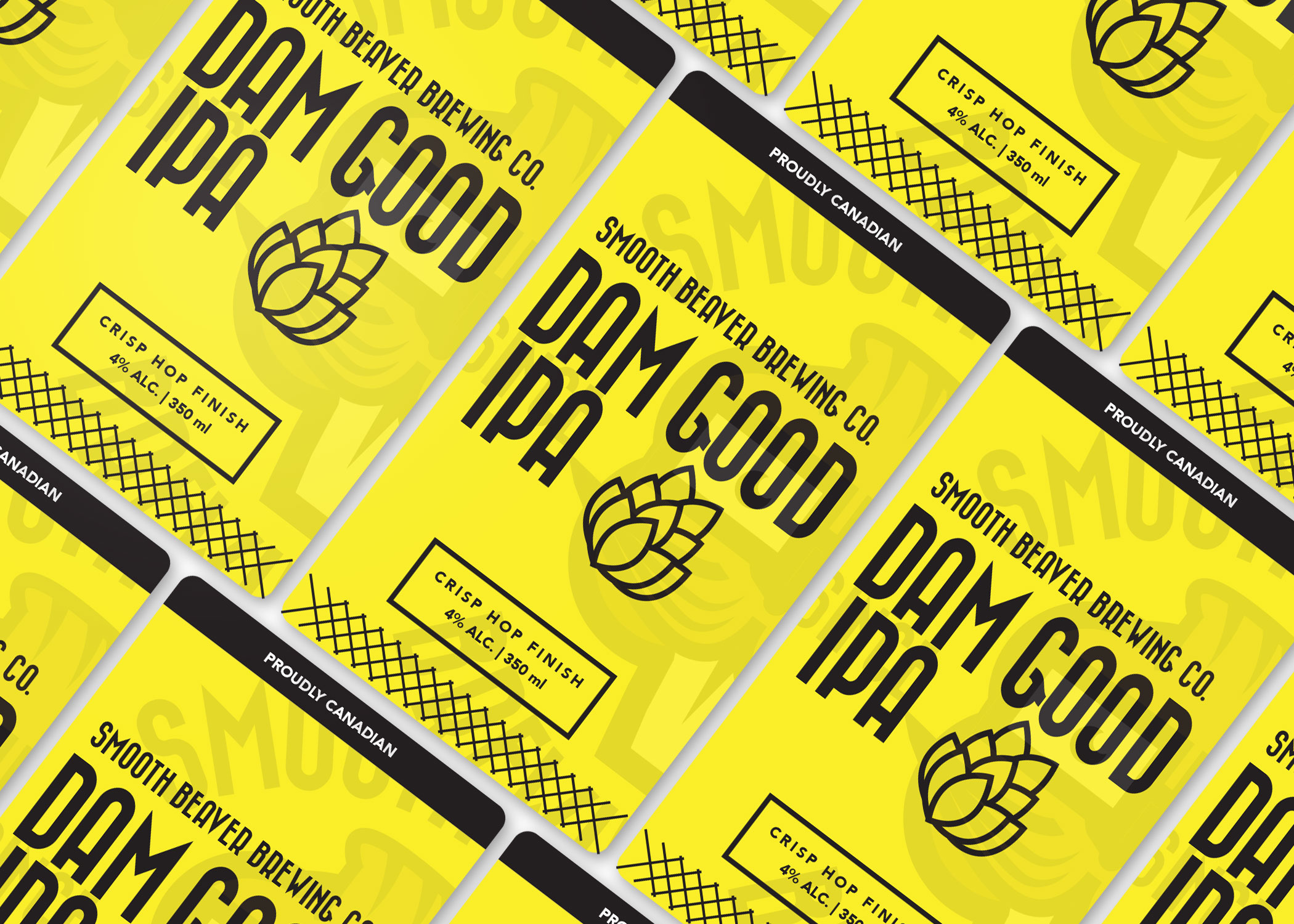
I was contacted to do this craft beer concept for an independent brewer in 2019. The idea was to create a single identity for one of their IPAs. The idea was that it had to be fun, Canadian and cheeky. After bouncing around some ideas about this “damn good” IPA, I wondered if I could build something around the description: it’s damn good. After some intense brainstorming, it seemed obvious that beavers build dams and are a known Canadian symbol.
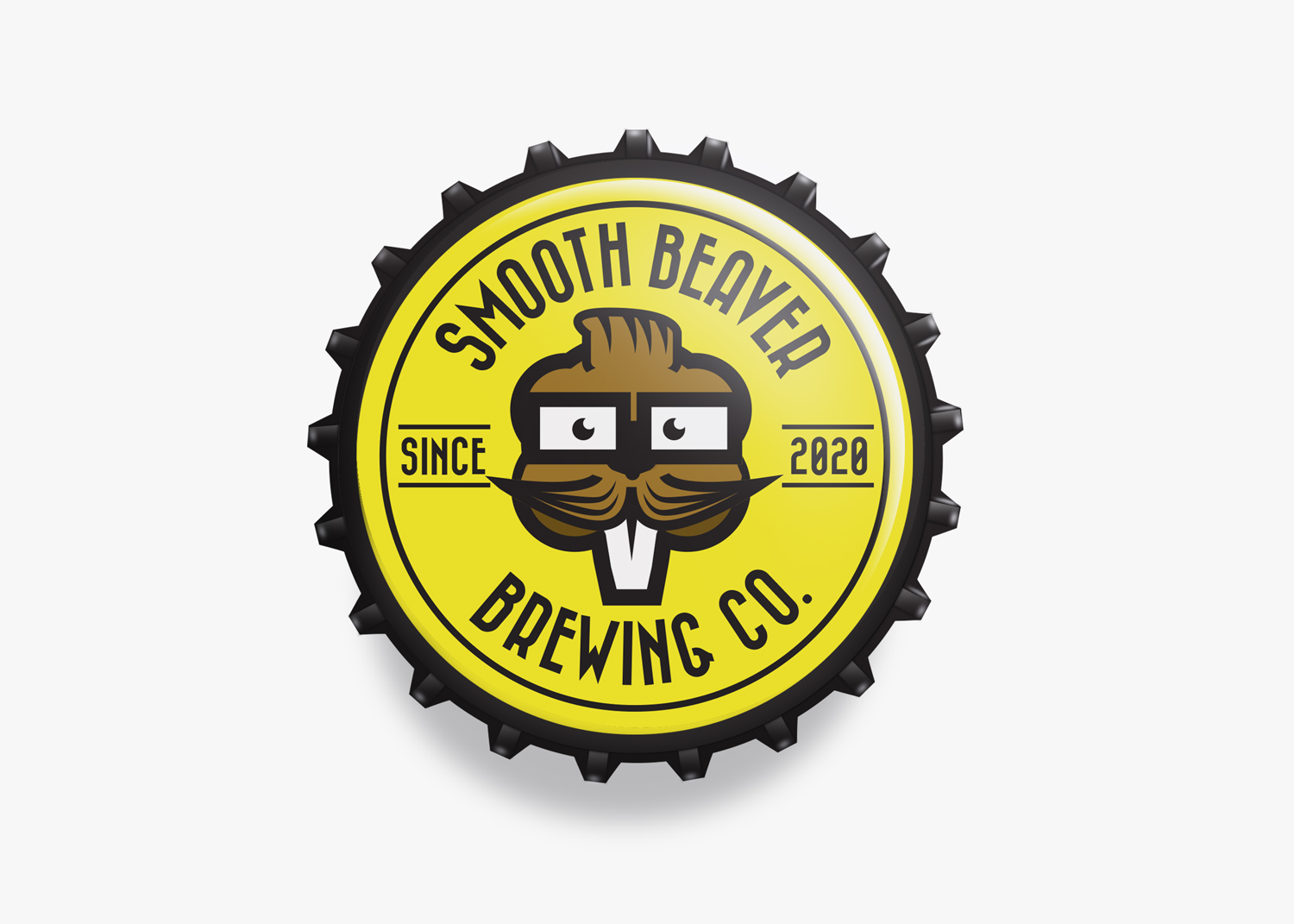
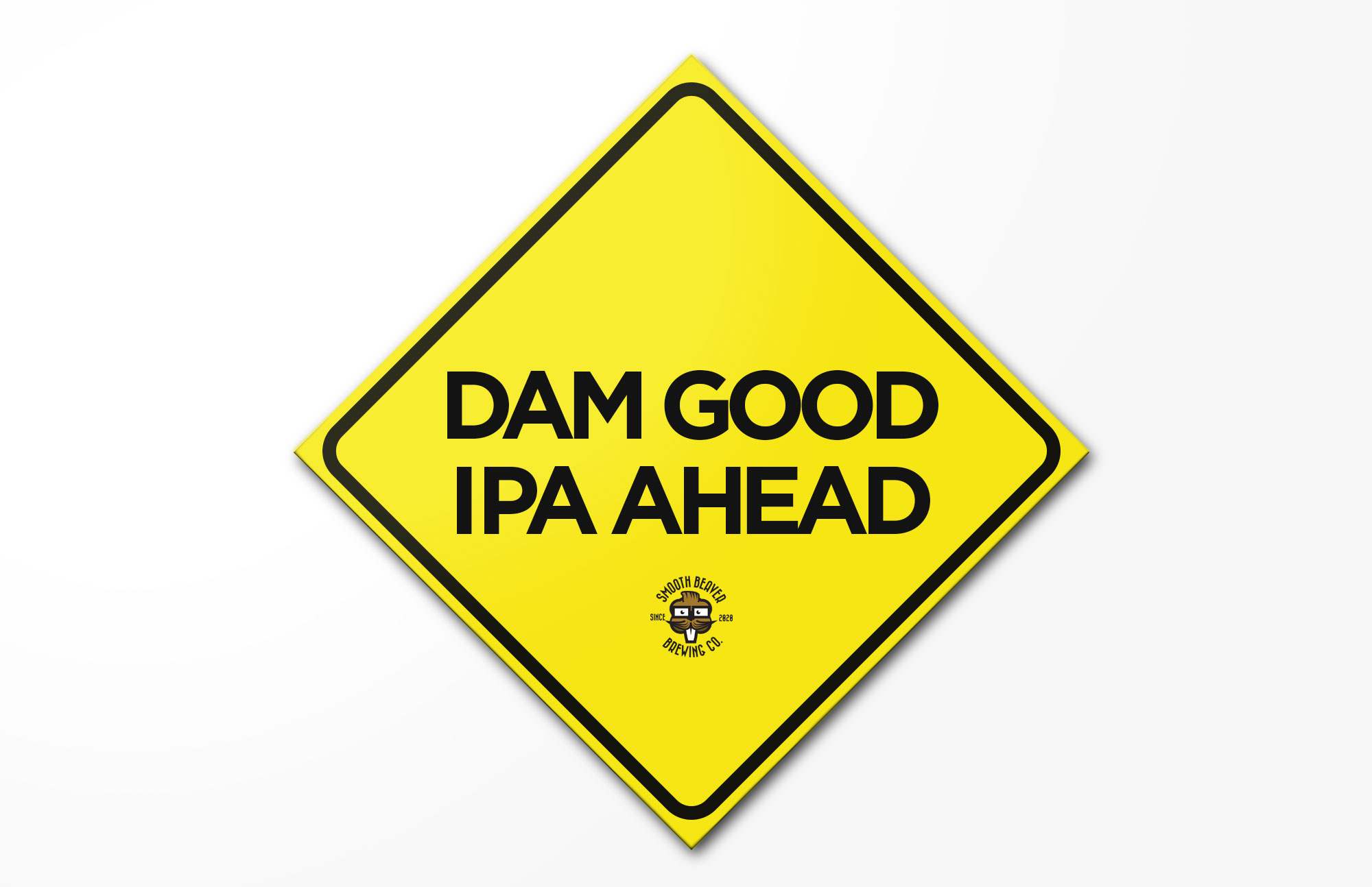
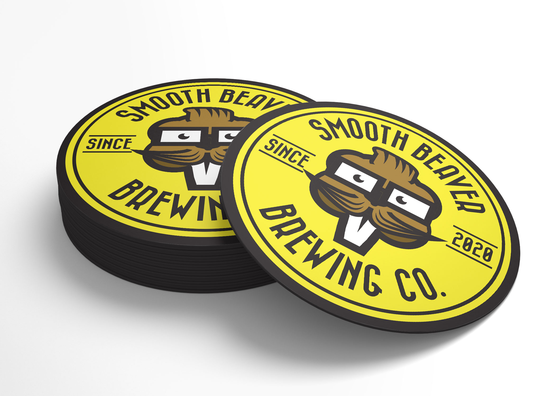
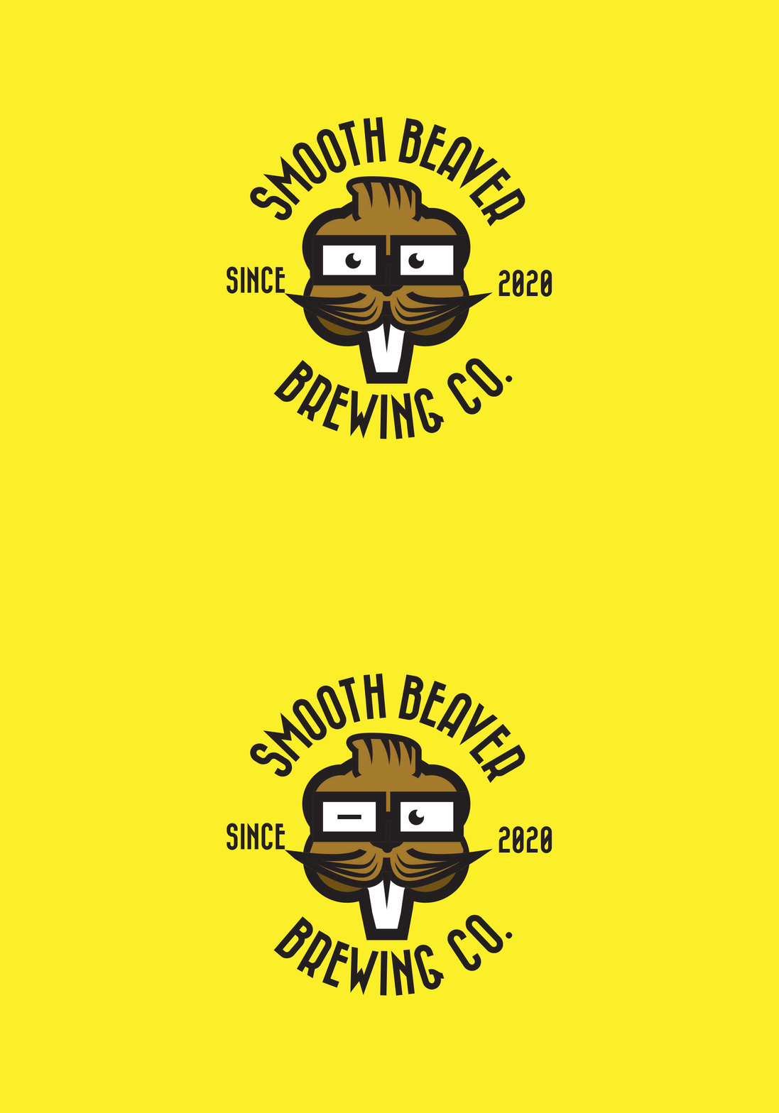
This later evolved into the illustrated hipster beaver with his slicked-back hair and thick-rimmed glasses as one of the fictional characters who would probably want to try this craft IPA. I kept the typography fun and uncommon yet modern. The colour palette was to be bright and fun to go alongside the humour in this piece - but also to bring the viewers eyes to something new and unknown. In a secondary sense, it was also to symbolize caution: a beaver is building a Dam Good IPA. All of the mockups (except for the coasters) I made from scratch.
